Sally Thurer I’m Sally. I teach at Pratt. I also teach at other schools; this semester I’m teaching at NYU. This is my fifth time teaching the same class at NYU, which is a really different experience than Pratt; it's an introductory foundation class based on the Bauhaus—I don’t teach anything like that at Pratt. I have an illustration practice, which is pretty regular. It’s mostly editorial. I’m doing a branding project, which is very illustrative. What else am I working on? I just got a grant to try to finish my Body Bottle (1) thing or try to get it into a more reasonable form. I’ve been trying to wrap that up for a number of years.
Looking back, I see my career as having two parts, which would be before grad school and after grad school. I was almost entirely self-trained before I got my MFA. I have a liberal arts degree. I majored in film theory at Columbia (2), and then I took a few classes at SVA (3) to learn some graphic design. I also read some books, looked at magazines, engaged with graphic design—not in a very formal way—and basically taught myself. I art directed two magazines during that period.
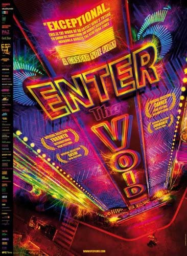
When I saw the financial crash looming and thought maybe it would be a good time to apply to grad school because I thought the magazine would go out of business, and it did. There was a two-week period between when the magazine went out of business and when I got into grad school, so that was very stressful. I got into grad school, and then I took the summer off and went to France; it was really fun. I forged a bunch of documents and went to the Cannes Film Festival where I saw a bunch of amazing films. It was great. Gasper Noe’s film “Enter The Void” is very influential for me, I saw that there. (4)
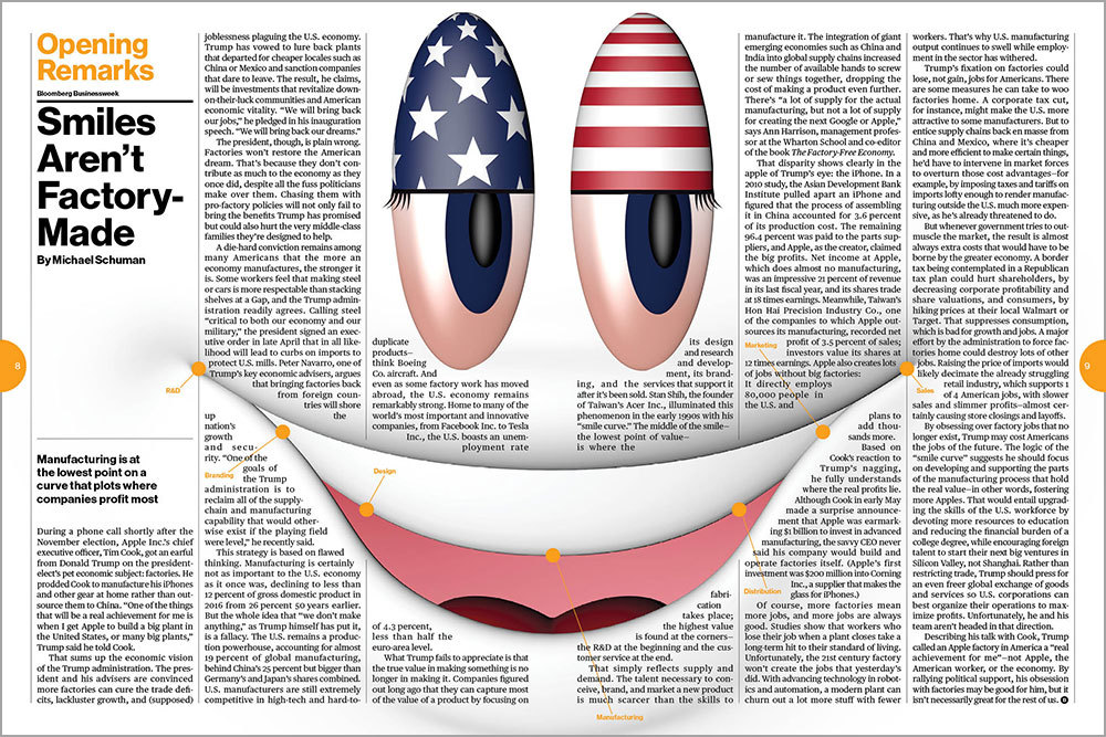
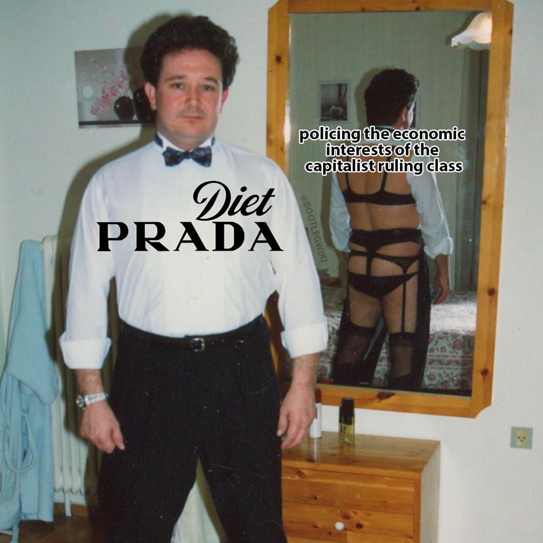
I would say after grad school is the second part of my career. The most visible thing I’ve done since then is working at MTV (5), but I’ve worked a few different places. I worked for a fashion brand for a while, I worked at Bloomberg (6) for a while, just filling in. The stuff I’m most proud of would be my teaching, my independant work, my illustration and MTV. I also have BootlegWiki (7) and that whole practice. I have all of these personal projects that I just do.
Logan Heffernan I didn’t know that you were teaching about the Bauhaus at NYU. In relation to what I’m talking to people about, that’s really interesting. I think you’re going to correct me on a lot of this. As I’ve come to understand it, the educational models that we’re moving away from in undergrad are models that were established at Bauhaus. We’re moving away from a curriculum where everything was produced for commerce. Bauhaus was focused on producing beautiful products, interdisciplinary works that were all geared toward the market.
ST I’ve never approached it that way—the Bauhaus curriculum being focused on creating commercial products. Can you tell me why you think that? It’s not wrong.
LH There’s this really good article written by Jacob Lindgren that was published on the Walker’s blog at the beginning of the year. It’s titled “Graphic Design’s Factory Settings,” I’ll send it to you. (8) At Bauhaus, there was this drive to make objects that were beautifully designed and had utility, but they lived in this strange space of being handmade while trying to skirt the hand’s own presence and suggest mass-production. The Bauhaus’ most celebrated projects are the ones we buy for our homes.
ST Well, but that’s just because capitalism is a totalizing system. You put the punk movement into capitalism and we get CBGB t-shirts. That doesn’t mean that’s what the punk movement was about. I don’t think that article’s wrong—but that’s not my entry-point into this or interest in the Bauhaus. I’d be curious to read that, though.
There’s a phenomenon where the Bauhaus just becomes whatever the person talking about it wants to be. It’s weirdly amorphous. For some people, the Bauhaus is about minimalism. “At the Bauhaus, form follows function.” I’ll be like, “Wait no, the Bauhaus is looking at gestalt psychology (9) and visual perception and applying those insights to composition.” They’re not incompatible points, but they’re just different views on what was important. Within the Bauhaus, there were a lot of different artists. There was conflict within the institution. For that reason, there’s a lot of material—you can cherry-pick an argument out of what’s there. I’m not an expert in the Bauhaus by any means, but I think it’s funny how it can be like a Rorschach blot.
LH One of the inflection points in the ways that I think about design comes from a moment junior year when I made some reference to ‘form vs. function.’ You looked at me in total exasperation and asked, “Do you really want to have that conversation?” I remember at the time wondering, “Well, what’s wrong with that?” Now I understand that it’s such a nuanced conversation. It becomes so restrictive when you only talk about form following function or function following form.
ST There’s nothing wrong with the idea of ‘form follows function,’ but if you’re looking at a blank page and thinking, “What is the function? How do I develop a form?” it’s just like looking into a vast abyss—it’s soul-crushing. Any time you add any element of subjectivity, you think, “I have to take this out because it is not following the function.” I want people to feel comfortable as they’re working. I’m very brutal on myself, and I don’t want my students to suffer like that. I think that concept, ‘form follows function,’ is tyrannical. It would be better if designers felt free to just make things and then evaluate them; if they made them how they wanted them to be, and then posed two questions. One: does this form serve the function? If not, how can I change it? The second thing is reflecting, asking, “Why did I make these choices? Why did salmon pink feel wrong and mustard yellow feel correct? What is special about mustard yellow?” In the moment, you might just have afeelingthat mustard yellow is going to work, but maybe when you take a step back from the project—either in critique or by yourself—you might suddenly understand those impulses.
I don’t want designers to feel so penned in that they can’t make any move unless they have a specific way to back it up. That’s not how you’re creative. There should be space to play because that play is often more directed than you’d think it is. (This is very Paul Rand, LOL!) I’m thinking of illustration—a lot of times, the emotional component of something is what you refine at the end. I just did an illustration of a cake and a candle for the New York Times, and I’m kind-of not happy with it. (10) I ran out of time; I really feel like it’s not conveying the right emotion. It wasn’t my concept, that was a concept given to me. I think it would be a much better illustration if you understood the mental state of the cake a little better. I didn’t have the time to adjust the colors and the shape; an hour-and-a-half more refinement would have conveyed the emotion of the cake better. I’m bringing that up now because I did it in the last two days. That’s where you make something and then refine it to try and get it into the right place.
LH This takes a step back from that and is more related to teaching and graphic design. I was looking through our syllabus from last fall, and the readings that were resonant—i.e. “Deprofessionalization” from Michael Rock (11) and the “Tool” excerpt from “Graphic Design: Now In Production”—were the texts that started to pick at the edges of what ‘graphic design’ is. (12) As tools become more democratized, as the barriers to entry in the field dissipate, how do you continue to figure out what graphic design is? As a professional and as a teacher, what is ‘graphic design’ to you?
ST It’s weird because I gave a talk last year that put some of these ideas together. I’m trying to remember it, and think of the readings from that class…
LH I’m asking because the readings from that class were very formative to how I began to think about graphic design. I started to consider it to be something with more dimension to it, as a practice with concept and critique. That world hadn’t opened up to me until I began to approach design as a field that you can read and write about; you can have a non-making portion of the practice.
ST In some respect, I think you’re asking the question, “What does graphic design practice look like after school?” You’re noticing the non-making part which can include writing an essay. It can include reading and being part of a community—all stuff I love. But, there are many ways to build a career; different people like to do different things. Don’t discount making—having a jobby-job or running your own personal or professional practice. It’s a little funny because the people with the loudest voices are the people who are online, on Twitter, publishing in design spheres—but they’re not necessarily the majority of the profession. There are tons of people out there making work and not reading the Walker blog. (13) That’s okay, all of these things are okay. I’m not really answering your question, I’m just saying, “Yeah, there are lots of ways it can be.”
In terms of the readings for that course—they are about authorship—who gets credit for the creativity. I worked at Graffiti Magazine in my early-aughts and the culture was about owning your own style; if you copy somebody crew’s style, someone might hurt you physically. I wasn’t a graffiti writer, but I was hanging around with a lot of people who had that worldview. It’s weirdly commerce driven; it’s really interesting how capitalist graffiti can be. It’s about self-promotion and advertising, it’s about promoting yourself as a brand, it’s about having a style that you have to earn that comes from a personal history. It used to seem that there was a contradiction between graffiti, which was illegal, and the commodities spawned from graffiti—the products that go along with graffiti, which were incredibly commercial. Now I don’t think so. The only thing that makes graffiti counterculture is that it’s illegal is that you’re destroying other people's property—it’s very much about property.
I came from a background where authorship and property were incredibly important. The worst insult was being called a “biter.” When I went to grad school, people were challenging that. I thought what they were saying was boring and I was very dismissive of it. I thought I heard it all. Perhaps the values were so core, I couldn’t imagine another way of thinking? A couple of years out of school, it suddenly had new meaning for me. I had a few things happen.
Urban Outfitters plagiarized some of my work. I had heard about it, but I hadn’t seen it—they made a t-shirt—and then one of my students wore the t-shirt to my class. That work was something that I had done years previously and couldn’t get into production. The fact that Urban Outfitters stole it, did all of the work for me, and my student was wearing it? I was like, “Wow! Where is this fairy godmother who takes the idea in my head and makes it real?” The shirt wasn’t perfect, by far. They had tried to cover their tracks so that it wouldn’t look like my work when it was clearly my work. Frankly, my “original” work was derivative of other work to the extent that I was self-conscious about it. One of the reasons why I hesitated putting it into production was that I was afraid of being called out for copying my friend, Gerlan. (14) I was taking inspiration from Keith Haring, but when I looked at the finished work I thought—wow, this kind-of looks like I’m biting Gerlan. I changed the colors around a little but still a few people remarked on the similarity.
I had all of this happen, and then I decided that, as a mental exercise, I would not care. I would let it go. I would embrace it and lean into the idea that my work would never be free from influence, and sometimes I would make things and other people would steal them. That turned into Bootleg Wiki. I started asking more structural questions like…why are artists forced to be so protective of their intellectual property when it is antithetical to the creative process? Why is culture forcing us to brand ourselves? The answers are, of course, economic. They’re external. It frustrates me that they have so much influence over cultural production.
LH When I was talking to Jessica Wexler (15), we were talking about the idea that the graphic design educator is no longer on this pedestal where they have the answers handing them down to students. Jessica spoke about all of us being “in it” together now. We’re in this space that’s changing so fast that the way we’re interacting with all of it is developing as it takes place; it shakes up the foundation of the typical teacher-student dynamic when we’re wading through it at the same time.
ST When I first started teaching, I was afraid to take any real position on anything because I didn’t want to influence my students—but then I realized that my students can disagree with me. Often, really disagreeing with your teacher solidifies how your own position. I love coming into intellectual conflict with a student because even if the student ends up not agreeing with me, they become really firm in their position—or maybe they open me up to looking at something in a new way. That’s awesome! That goes along with understanding that my position is going to change over time as I learn and grow—being upfront about that and being able to connect with a student a year, three years out, five years out, and being like, “Look how much we’ve both grown and learned.” The fun part about teaching is learning. A lot of us want to be teachers because we wish we were still in school. It’s boring when you’re being didactic, and it’s more fun when you’re reading and learning and assigning material that is interesting to you.
Michael Rock writes about this in Deprofessionalization.At the beginning of the 20th century, graphic design was a trade; think of the printing press. It was blue collar work. By the middle of the century, it started to become more like architecture. It required training, You would deploy a certain set of learned skills—like typography. Now there’s a push to develop a critical discussion of graphic design and to position it even higher, which I think has a lot to do with it becoming academic. There are more graduate programs and even PhD programs in graphic design—what are they studying? Academia manufactures itself in a way—and that’s a good thing! I’d love to see graphic design on par with architecture.
So far, a lot of the critical theory around design is based on conceptual art. It promotes the idea that if graphic design is more like conceptual art, somehow it’s better than if it’s formally driven. That’s something I fundamentally disagree with. I love conceptual design, but I feel like a generation of designers across the field have been trained to privilege conceptual thinking, so there is a lot of work like that now. It’s like, “Let’s take the logo and turn it upside down!” Okay…? How about drawing something beautiful and expressive? I think a bias has developed where cleverness is favored and beauty is disfavored—the apollonian over the dionysian. It reminds me of David Batchelor’s writings about color in Chromophobia. (16) I think cleverness and concepts are easier to talk about so they are favored over beauty which is murkier and more mysterious, but students need both.
The original set of readings for your class was intended to set up to help you let go of an attachment to authorship so you can welcome other people into your process and be more collaborative—make tools for other people to use. That’s positioning graphic design as conceptual art. We talked about Sol Lewitt (17) right up front. While I was teaching that, I was exposed to Fred Turner’s lectures. He builds this trajectory from the Bauhaus (Herbert Bayer) to Black Mountain College and Buckminster Fuller, to The Whole Earth Catalog and hippie communes like Drop City—it all feels very utopian. But where he ends up is in Silicon Valley where these values have evolved into something very manipulative, very exploitative. It’s pretty dark. (18) If you follow up to that end-point, you get Burning Man and ‘design thinking.’ I think I went into an intellectual crisis while I was teaching your class because I was really into all of the hippie counterculture stuff and the conceptual art, but I feel anxious about what’s happening in silicon valley and conflicted about the implications of design thinking.
LH When I was talking with Jessica [Wexler], she mentioned a reading that you wanted to assign your students but were worried it was too dark and too condemning of graphic design.
ST That’s Fred Turner, yeah. Fred Turner’s stuff is really dark, and I’m not even sure he’s really right. It’s one of those things where, when you read it, you feel very seen. He understands certain truths about design, but I think he wants to backtrack to an earlier time. I don’t think that’s possible nor do I think that’s the right solution.
Look, I think graphic design is really fun, I think my students are really talented. I think they can just make work and most of the time it’s pretty great. I don’t need to assign them dark readings about how graphic design has been destroyed by narcissistic baby boomers. You guys aren’t boomers—you have different values. I think that’s useful for certain people to read and understand, but it doesn’t feel like it’s right for undergrads. That said, I don’t know if teaching design thinking—uncritically—is great in undergrad. We need to teachenoughdesign thinking so that when you’re in the workforce and hear those words, you know what they are and you know how to jump through those hoops if you are called upon to do so. But, there are plenty of people critical of design thinking in the design world.
Also, design thinking isn’t all bad. There are good things to take from it, like user-testing, and there are things to leave behind—like the cult of the amature. I’m a big believer in user-testing!
LH That’s one of my major questions as I finish my time at Pratt: what is the end-point of all of this? What am I walking away from my BFA experience with, and what should I be walking away from it with? For a while, I was under the assumption that the BFA is trade school. If you want to be critical, that’s the practice you develop in your MFA program; BFA is proficiency, MFA is criticality. Maybe there’s some dissolution of that?
ST It matters how much you actually care about graphic design! Trade school is fine if there is NOTHING at stake. “Oh, we train these kids to be cogs in a machine so they can get jobs, and if they want two more years, then we encourage them to think for themselves and potentially push the future of graphic design forward.” I mean… that’s ridiculous! Totally ridiculous! We’re training people to replace us.
Hopefully, you guys will outlive us and you will then be in charge of graphic design and what it is and defining those parameters. We need to give you enough tools to do that. Those tools are not telling you what to do so you’ll obey us but rather giving you some things to think about so that, looking forward, design becomes what you make of it.
LH That gets back to the idea of the end-point; it’s constantly shifting. For so long, the end-point of graphic design was publishing as a way of disseminating information, and then the end-point became creating a vehicle for marketing, and now we’re in a space where we’re scrambling for the end-point to be… community, maybe?
ST I think, to a large extent, the end-point is whatever the brief is. We’re trying to come up with these huge overarching claims about design, but, in actuality, design is applied one project at a time. One project might be selling a product, another might be designing an emergency exit sign. I don’t think interpretative dance is a good solution to an exit sign—it’s not! I think different problems demand different solutions, and it’s about modulating that. A single designer can apply different strategies to different kinds of problems. If I were to design an exit sign, I’m not sure I would design it in irridsecent blobs with pink and purple hands; I would do something clear and easy to see.
I get enormously frustrated by “woke” marketing, which I think comes out of a push to make marketingmeaningfuland not acknowledging that straightforward marketing is a valid end goal. The thing I hate the most on earth is The Wing, which is the “feminist” co-working space. (19) It’s an extremely expensive social club for “girl bosses” that’s couched in an image of feminism and empowerment. The design obfuscates it’s true intention which is essentially a pyramid scheme to promote Audrey Gelman’s clout. The design is used to hoodwink you into thinking that somehow you’re doing something virtuous by handing over thousands of dollars to these rich girls to sample high-end beauty products in their bathrooms. It’s so opaque that it’s deceptive and it’s hurtful to women. The whole aspirational image, the pinky polish of it, demands it foists on it’s audience—it’s the beauty myth! (20) It’s total misogyny. Bring back Phillis Diller feminism! Bring back Wendy Wasserstein!
A lot of the Silicon Valley branding—I think I probably gave you guys a reading, I just gave it to my seniors—uses baby-talk and cartoons to sell itself. (21) It’s infantilizing. It’s really about not treating people like adults who can take care of themselves and making them dependent on these apps and services in order to even eat dinner, you know? That branding is dark because it’s promoting a certain powerless-ness, a dependence. It’s celebrating it.
I think it’s possible to just make coffee look delicious. In a very fundamental way, a lot of the work I’ve done in my career is about, “How do we make the coffee look delicious?” I would love to see more advertising like that. I miss advertising that really works. I constantly go back to Coca-Cola ads—Diet Coke, particularly. Coca-Cola will make ads where the Coke looks delicious (22); it's splashing all around, and there are bubbles everywhere (23), and there are beautiful young teens on roller skates at sunset. And I’m like, “I want to be a beautiful young teen drinking Coke on the beach!” It’s working in a really visual way, a really fantasy-like and imaginative way. (The Parachute hibernating campaigns are also perfect. (24)) I hate the Casper mattress ads that are like, “I’m Dracula on a mattress!” I don’t think they’re funny, I don’t laugh at them, and I don’t think they sell mattresses. This goes back to what I was saying about conceptual art vs. form. It must be easier for agencies to sell these stupid punchlines to clients because they’re easier to pitch than formal approaches.
The Wing is more evil than Casper though, because it’s a wolf in sheep's clothing—using design to repackage careerism as feminism.
LH It’s like rainbow capitalism, washing something in the language of any progressive movement.
ST Pink-washing, rainbow-washing; all of that stuff is just so toxic.
LH I’m curious if you consider graphic design as something that is or isn’t consequential. There’s an urgency right now—with myself and a lot of my peers—because we are about to be launched into the world at such a tumultuous time; we want graphic design to mean something. We want what we do when we go to work to maybe have a positive impact on the world at large. I think that’s why it’s so easy to hoodwink people into believing in something like The Wing or getting designers to work on a campaign that green-washes a cafe chain. We’re all scurrying for a sense of consequence or impact.
ST I think that having someone in the room asking, “Are we going to really greenwash our product right now?” matters. I don’t know how precarious you will be your first year out of school, but you could be that someone who can make that argument might stop a company from doing it. That is valuable.
Designers think it’s cool to say graphic design isn’t important because, in a lot of ways, it’s not. When they say that, what I hear is, “The kerning isn’t important.” There are certain aspects of it—the professional skill and refinement—that we see because of our training. It’s invisible to non-designers people and is functionally inconsequential in most cases. The punchlines to a lot of font jokes are that typefaces are indistinguishable or effete.
But there are aspects of design that I think are very important—like style, visual presentation and methodology. I wouldn’t be teaching design if I didn’t think it was worth studying!
Style is important because it communicates certain attitudes visually. Sociopolitical ideas tend to work themselves out in the arena of fashion and style before they bubble up to mainstream culture. Stewart Brand has a theory about this called Pace Layers in his book, The Clock of The Long Now. (25) I don’t buy into it entirely but his observations about fashion feel right, and it’s an interesting model to think and talk about. (Pirco [Wolfframm] put me on to this!) The semiotics of style might possibly be my favorite subject.
Visual presentation—I’m not sure what else to call it, maybe thefunctional mechanicsof design—are consequential because they shape the whole experience. This is where nudge theory comes into play (26), with the designers encouraging cafeteria customers to eat apples instead of chips by placing them at eye level. I often think of this in terms of labor—doing work so the user won’t have to. These approaches are generous, but manipulative. Maybe the user will resent not knowing chips were an option that they didn’t see. This aspect of design—and I think it applies to all areas of design—is enormously consequential. The ethics should be considered on a case-by-case basis.
Methodologies are consequential because they are built on certain attitudes and assumptions. For instance,auteur theory(this is a film thing) posits that the director is the author of the movie and should exert personal influence over their collaborators in order to realize their artistic vision. The project is highly controlled by one person. Design Thinking devalues that sort of subjectivity completely. That methodology is built on the cult of the amateur—a belief that designers with experience, skill and expertise have been indoctrinated into a cult of repetitive best practices (or worse—artistic self indulgence) and need to turn outside the field for ideas. It recasts designers as managers, market researchers and user testers. These are wildly different approaches built on wildly different values that produce wildly different kinds of results.
LH Is there space for ethical practice in graphic design? When we talk about ethical practice, for some people it's a conversation about capital, for some people it's a conversation about gender equality in the workplace. As I’ve tried to grasp, “What is ethical in graphic design practice? How can an institution like Pratt encourage students to think about the ethics of what they’re doing?” I’ve found that criticality is at the heart of all of this. If you can’t reflect on what you’re doing and place it in a larger cultural context, you can’t really understand the implications or the consequence of it.
ST A lot of times, when people want to make an ethical practice, their first move is to go after ethical clients. They start doing cultural clients or non-profits. The other thing they do is become teachers, so I think you encounter a hugely-biased sample because that’s the kind of person that ends up teaching. I, personally, would like to see it being more an approach, a way of making work. This comes up a lot of times with feminism for me because I’m a woman. I’ll often be asked to make work that’s about being a woman, and I get frustrated with that. I would rather make work for everybody and just be a woman while I’m doing it. I see ethical work in the same way; I would love people to design a signage system or a magazine or a sneaker campaign and have them be ethical while they’re doing it and not make the campaign about ethics. That’s where this anger at the woke-washing comes from; it makes statements about these issues but does not implement these philosophies.
LH At some point, the differentiation then comes down to when is an individual practicing their ethics and when are they just virtue signaling?
ST I’ve been bouncing around with this ‘virtue signaling’ stuff. I’m not a fan of virtue signaling, it tends to annoy me, but it also feels impossible to avoid. I’m sure if you googled me it wouldn't be hard to find an example. That said, I don’t see anything wrong with making work because you care about something. I recently had this moment with the Bernie campaign where I didn’t want to make Bernie merch because I wanted to do something that would really get Bernie elected, and I didn’t think the merch would get him elected—it seemed like a self-promo piggybacking on Bernie. I’ve been phonebanking, but at a certain point, the graphic designer in me started making merch because that’s just what I do, and I have the tools.
I made this “Boomers for Bernie” sticker (27) and have been contacting boomers on Facebook and having them sign up to get a free sticker. In doing that, I’ve been asking them, “How are you going to get to the polls? Do you have a plan?” I’ve been doing the same stuff that you do while canvassing but using this merch that I made to forge a connection. What I was thinking is that it’s making a similar impact as if I was phone banking for Bernie, but I’m using my own skill to maybe personalize it. What else can I do? I can’t single-handedly get Bernie elected. I haven’t succeeded in that. Is this virtue signaling? I don’t know. I really want Bernie to be the president!
I don’t think people should be so hard on themselves for virtue signaling, but there’s a certain category of people who don’t get it—like people who say, “I don’t wear logos.” That’s so annoying. A lot of times it’s corporations that are doing it, and you’re like, “You don’t care!” Corporations aren’t people.
LH It’s like Jeff Bezos pledging a bunch of money to combating climate change recently. (28) That doesn’t suddenly make Amazon a company with ethical practices.
ST Yeah, he should just be taxed. He should just have to pay that to us in tax, and we should decide where that money goes. He’s not a good person for demanding tax breaks and then giving money to some charity that he selects.
LH We all want to think that if we make a t-shirt for Bernie, that is our ultimate contribution. Like you were saying, you made this sticker, but it was also a way for you to essentially phone bank—that’s direct action. If I were to make a t-shirt and post it on Instagram and say, “Well, there it is. There’s my contribution,” that’s such a privileging of graphic design.
ST If you’re already asking yourself the question, “Are you virtue signaling?” you’re probably dealing with it in a critical enough way. I actually really agree with what you said; if you just put it there and walk away, it's not the same as using it as a tool.
LH We want graphic design to be the answer to everything because it’s what we’re most comfortable with, but it’s only the answer to a select field of problems. Making a t-shirt isn’t phone banking.
ST This is happening a lot in thesis—people are encouraged to take on these huge issues, like food deserts in cities or the pollution of the fashion industry. They’re taking on these huge almost-unsolvable problems and then they’re like, “I’m going to make a campaign to raise awareness about this issue.” There are so many interesting ways design can be used, but I also want them to think about—functionally—if they wanted to solve this problem what would they do? In senior project last year, one of the assignments I gave was to create a gift for a specific person. That’s a very Laurel Schwulst-derivative project (29), but the idea is that if you’re making something for a specific person, it makes a really focused brief. You wonder, “Have I delighted the other person?” It takes design out of the world of typefaces and grids traditional tools. It starts being about, “How do I accomplish this task using my communication skills?”
I think there are a lot of problems that we can address using these communication skills, but the idea of making a zine or making a t-shirt is often not the solution. Thinking about creating ‘happenings’ or using these tools in a larger context opens up possibilities. I think a happening could have a lot of impact. A rally is a happening; how do you design a rally to really elect Bernie? You can imagine a not-very successful rally and a very successful rally? I think a lot of those moves are design moves. How do you design the space? How do you design the stage? Is there merch? Is it for sale, or is it given away for free? What does it look like? What do you talk about? Is there a song you sing? All of these things, these are all design things.
LH I find it important to deeply consider, “How counter-capital and how countercultural can design be?” Especially in this country, there’s the constraint that we don’t have the same government funding that other nations do. If you look at Metahaven (30), they’re operational because they can get grants for making all of their work. There’s something specifically American about how difficult it is to distance yourself from work where the end-point is amassing capital. When we study design and consider the ways different practices operate, we don’t necessarily take into account the privilege behind a lot of them when it comes to funding. It would be much harder to have a US-based Metahaven than for the studio to operate as it does today in the Netherlands.
STThere are a couple things at play. National funding for the arts is one of the things, that’s a great thing. I’m not sure how much expertise I have to talk about this,but I can talk about the nature of late capitalism and the online economy and how it’s really changed a lot of the models for these sorts of things. Everything has become extremely competitive and atomized now; it’s about how many likes you have on Instagram, which really disrupted a lot.
I consider myself a populist. I love all kinds of stuff—low, middle and high brow—but I’ve never equated beingpopularwith being good. With social media, there is actually a metric. There is a “most popular” cupcake baker and a “most popular” tennis player. It’s a winner-take-all mentality. It would be wrong to say there were more lanes before, because with the internet there are infinite lanes. But there used to be more financially sustaining lanes. It’s all very public now. That puts a lot of pressure on artists to have mass appeal out of the gate. Often that can lead to shaping work to appeal to preexisting tastes and expectations.
LH As an educator, do you think there’s a way to better prepare students entering the workforce to navigate the chasms of capitalism?
ST Definitely. That’s where the critical thinking skills come in, right? There’s this idea in liberal arts education that you create thinkers by teaching them how to read and write; that teaches them how to understand information and express themselves. I think design education should be the same thing but about visual expression, having control over the making of work as being the output. By creating students that are thinking critically about information and then are able to process that and put it into work, it prepares them for a lot of different kinds of jobs. That’s why we’re stressing thinking and not just skills-based learning.
I feel like we’ve been talking for a really long time, and we haven’t been talking about the program—I’ve just been rambling.
LH It’s hard to talk about the program directly because building a curriculum with hundreds of moving parts is no small task. The program is going to take ‘x’ amount of time to shift in a certain direction or this many years to consider ethics and criticality. There are constraints on that happening at an institutional level, so it’s more about providing alternative ways to engage with this thinking or building an educational supplement. It’s about finding ways that people who care about these things can help provide a toolkit for people who care about these topics but don’t know how to navigate them.
ST I think thesis is a really good model for what the curriculum can do. Part of thesis is to get you guys to define a point of view for yourselves and to think reflectively about what your approach is to graphic design and to be able to talk about it. Another thing is just for you guys to make a project and complete it and know that you can do that. There’s a real power in knowing that you have the capability to come up with your own idea and execute it.
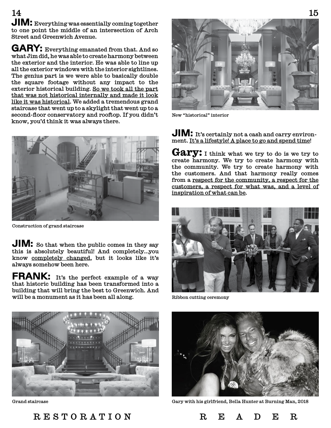
I was upset about this Restoration Hardware video I saw on the internet a few years ago, and I would talk about it occasionally—I’d get really fired up about it. Then I realized, “Oh, I can make a zine about it!” (31) One thing I know I can do as a graphic designer is make a zine. If I sit down for six hours, I’ll have a pretty good zine. Having made a zine before and knowing I can do it—that feels really great. Then the zine became a tool. I had a little “happening” at this fundraising event, and I went on Harry’s podcast with something tangible that allowed me to talk about these issues that were bothering me. (32) It maps on to what you guys do is that in thesis, you make a beautiful deck of tarot cards that has meaning for you because you researched tarot cards—or you develop your own philosophy for graphic design by interviewing your friends and reflecting. You come up with these projects and create a tangible output that enables you to talk about your ideas with other people; but it also reminds you that you can do this, you have the tools to do this.
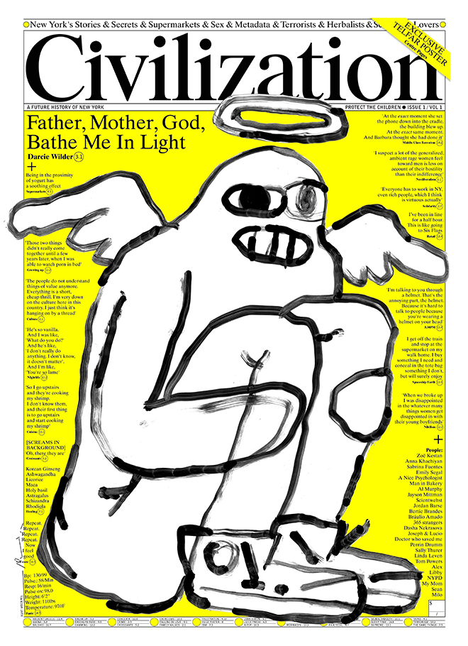
Moving forward, it becomes important—mid-way through your career or late in your career—to think, “Okay, so I’ve worked for other people for a while. Now—what do I want to do? I know how to do a project, I’ve done a self-initiated project before.” Whether that’s starting a fashion line or starting a newspaper—Richard started Civilization; he was in a creative crisis so he started a paper! (33) Different people do different things; starting your own agency, creating a platform or community, experimenting with ceramics, inventing a new form of theater. Having started and completed a project makes you feel good and capable to take things on.

